


Skip to content
ōna

Launching a new adult self-care brand

Industry
CPG, Health & Wellness
Services
Brand strategy, Creative lead, Packaging design

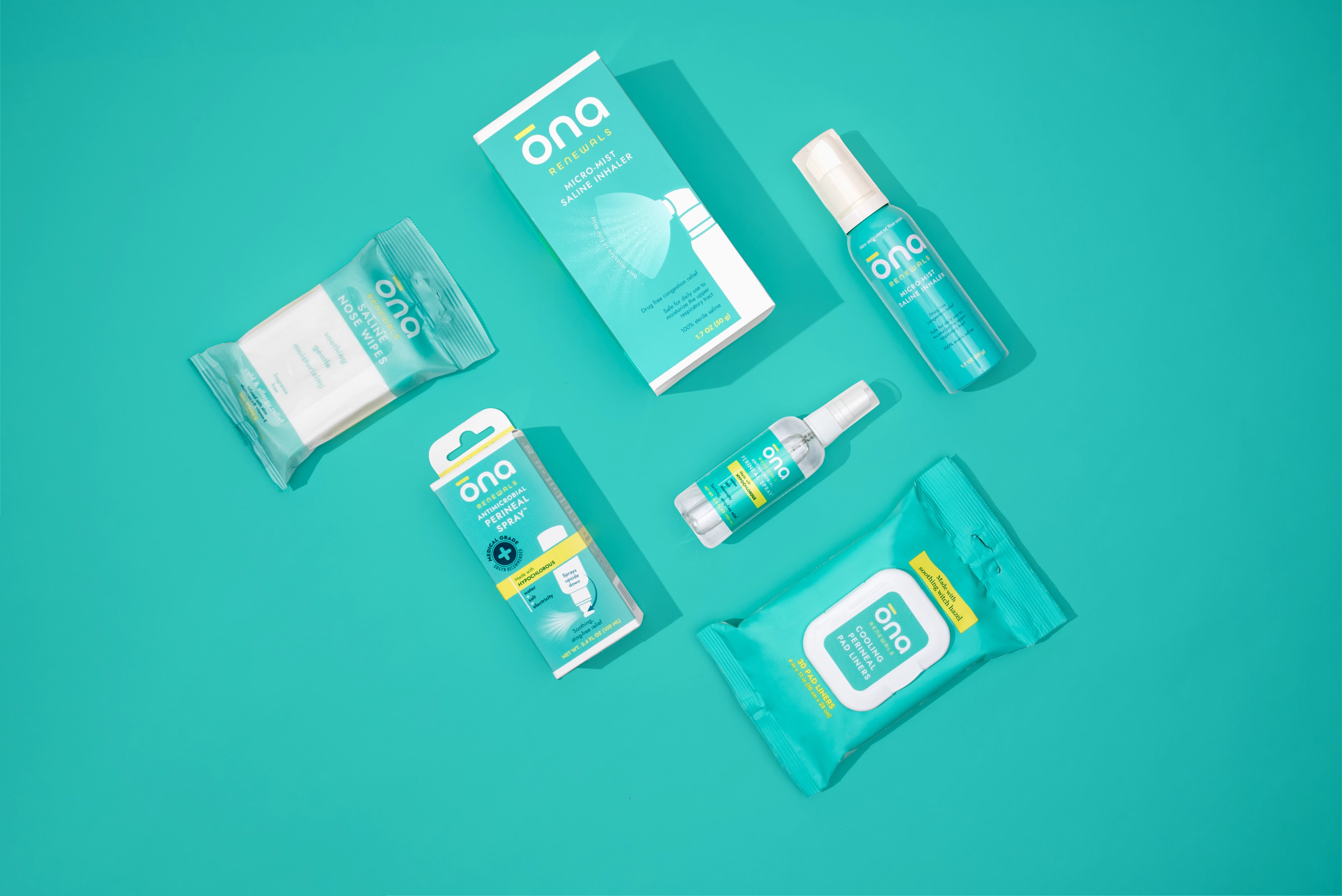
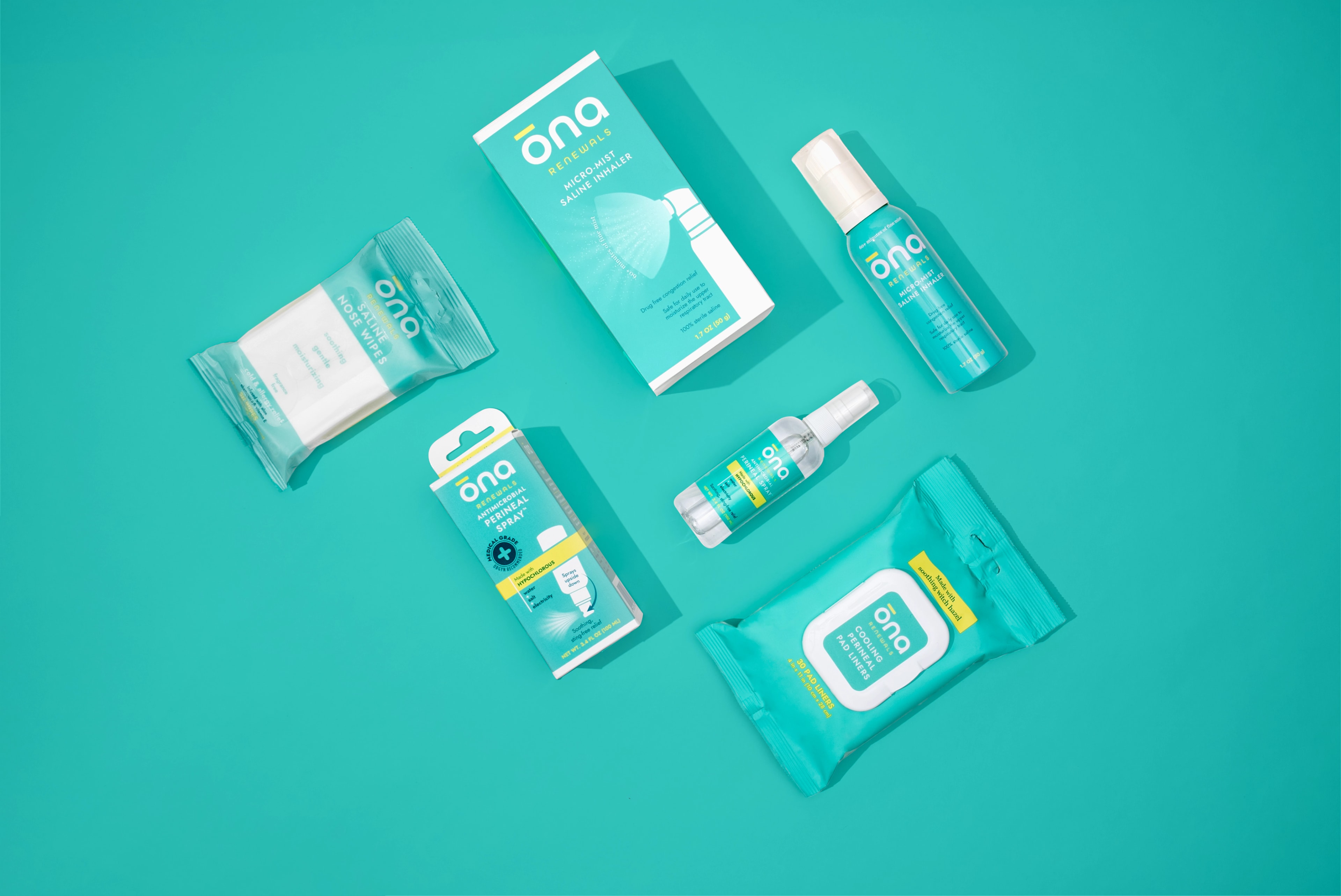
Synergistic partnered with ĕleeo to expand its trusted natural-based product portfolio into a new adult self-care line focused on cough, cold, and postpartum care. We created ōna from the ground up, developing the brand strategy, positioning, name, brand identity, packaging, and eCommerce website.

ōna Renewals wordmark in white with a yellow accent bar on a teal field
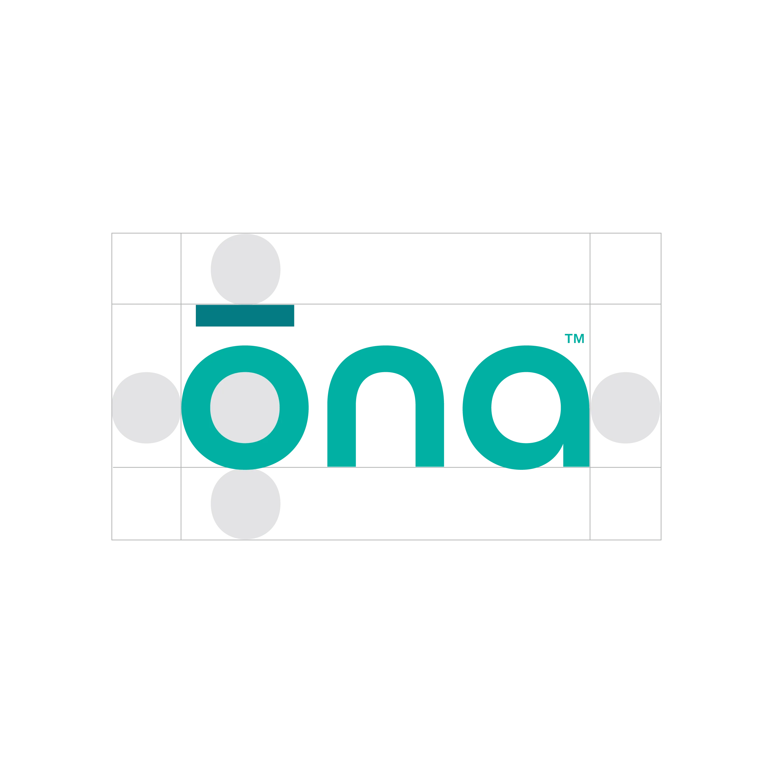
ōna logo construction grid showing the circular letterforms and accent bar
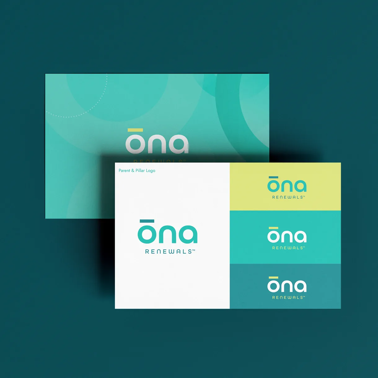
ōna Renewals business cards in teal, yellow, and white on a dark teal surface
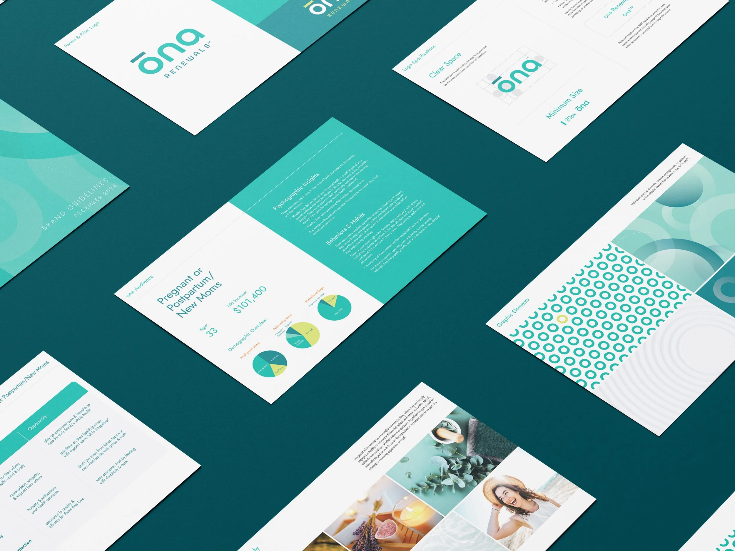
Spread of ōna brand guideline pages fanned across a dark teal background
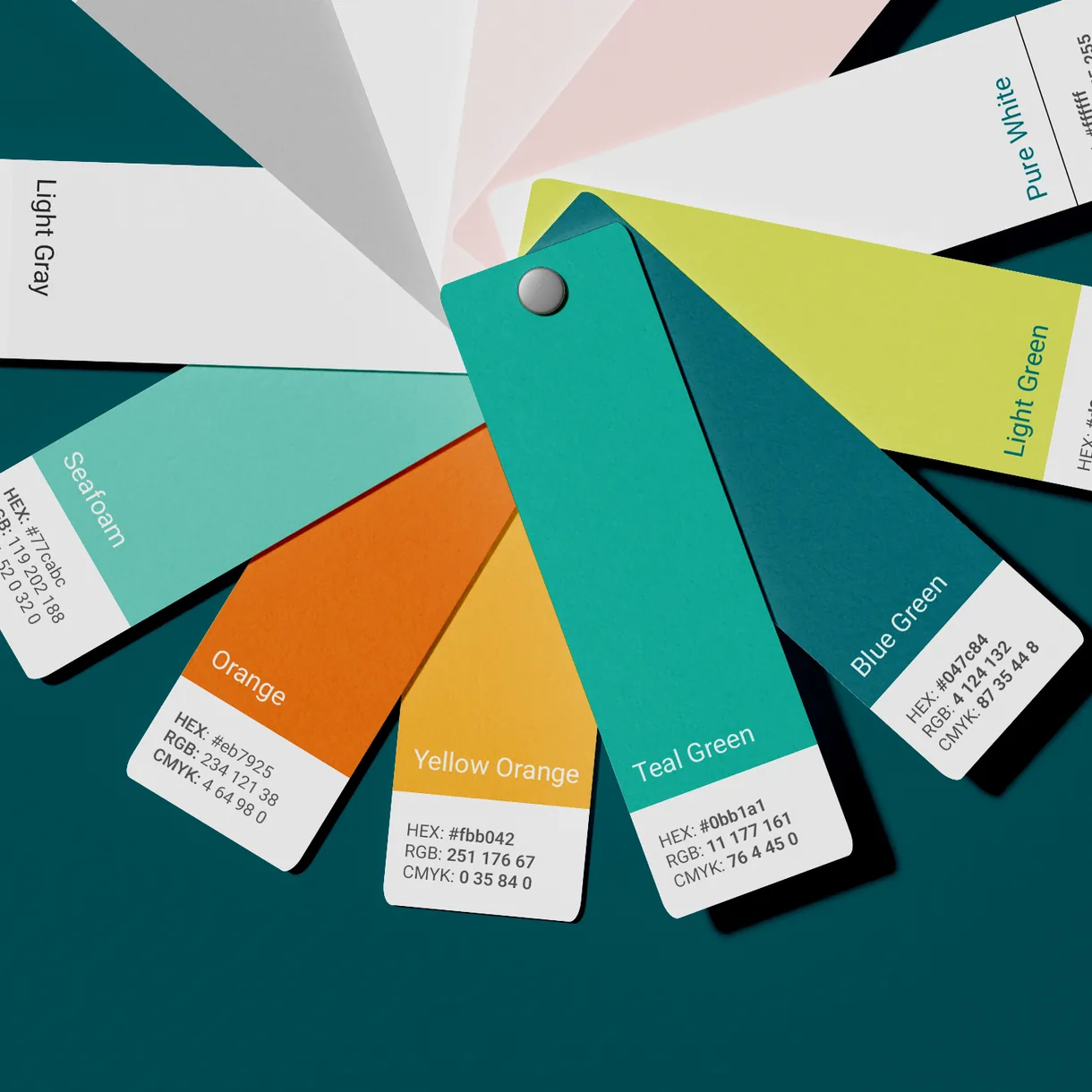
Fan of ōna color swatches in teal, green, orange, and neutrals
ōna ring pattern of teal circles with one yellow ring
Informed by key audience insight, we identified three territories to explore for ownable naming options and a unique design aesthetic, ranging from uncluttered simplicity to multi-sensory experience to joyful expression.
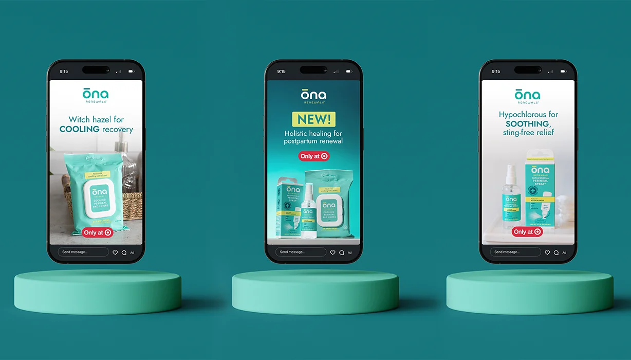
Three phones on teal pedestals showing ōna social posts for cooling, postpartum, and soothing products
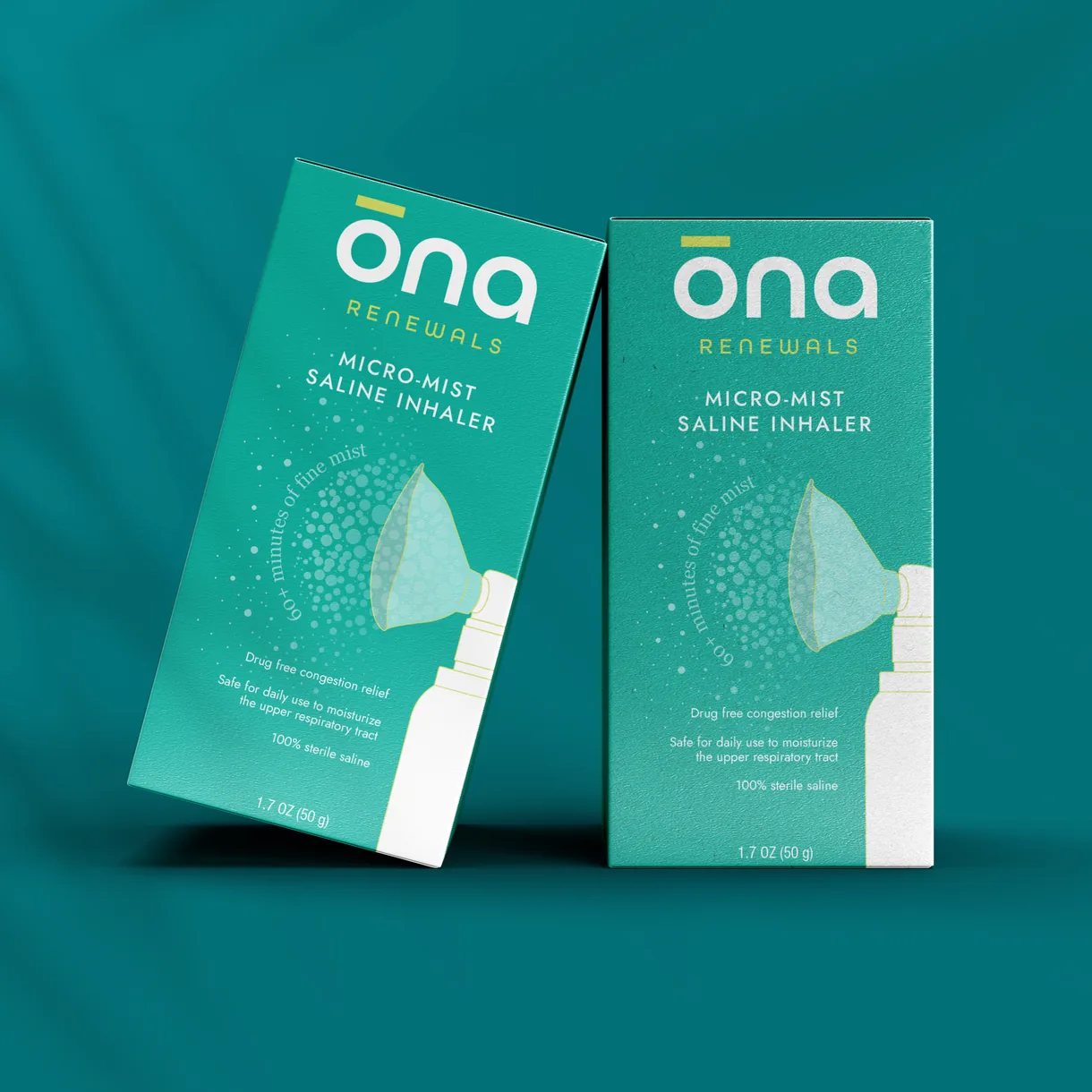
Two ōna Renewals micro-mist saline inhaler boxes on a teal background
ōna brandmark, a white ring with a yellow bar, on teal
ōna brand icon of hands cradling a water drop above the words gently effective
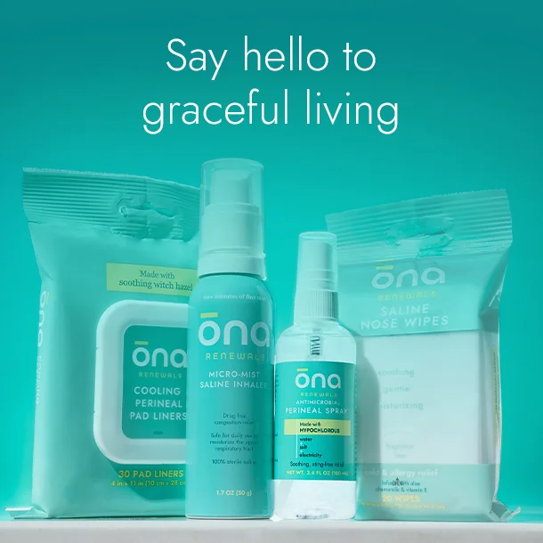
ōna product lineup with the headline Say hello to graceful living
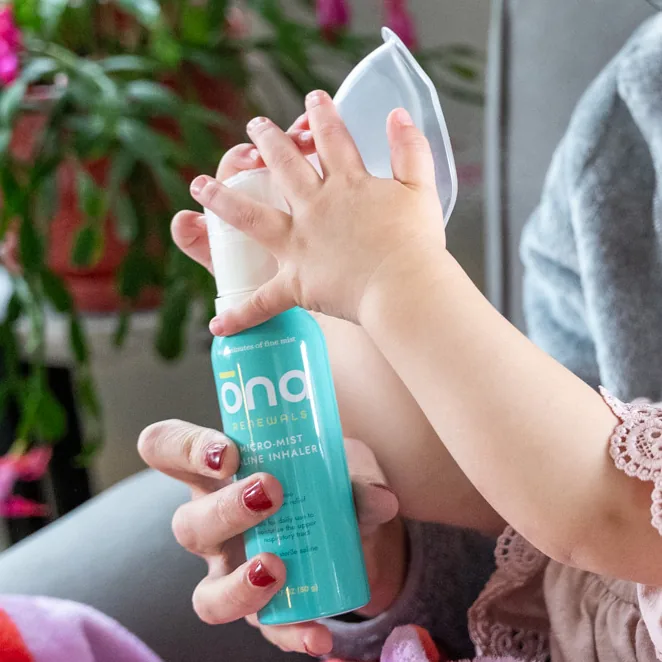
Parent's hand holding an ōna spray bottle beside a baby
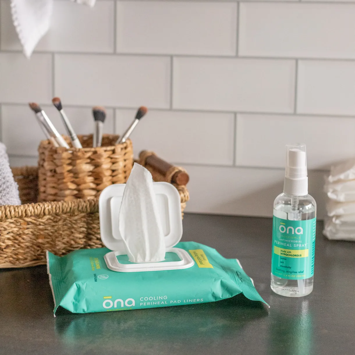
ōna wipes pack and spray bottle on a bathroom counter
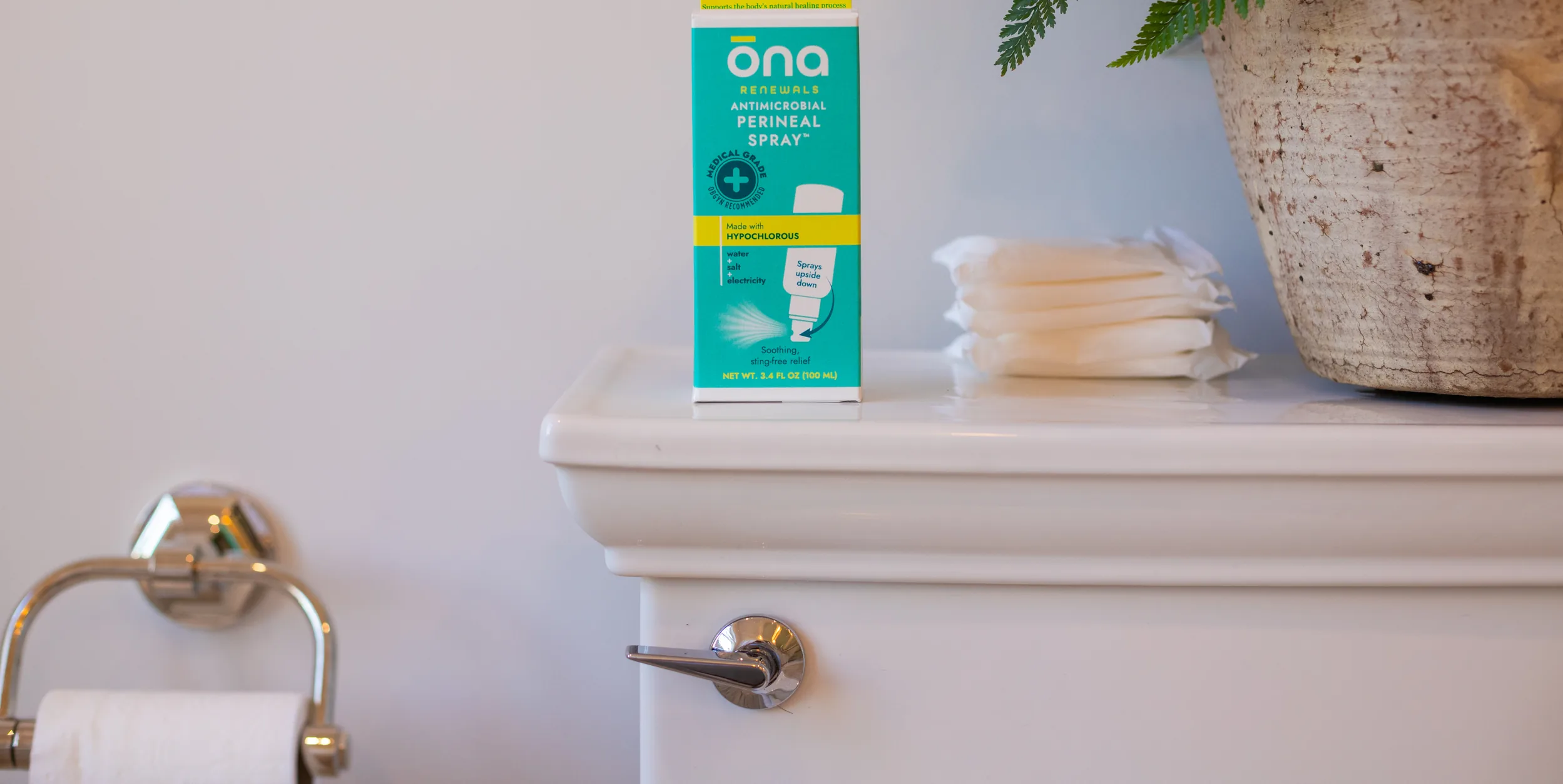
ōna postpartum product box on a bathroom shelf beside folded towels and a plant

ĕleeo brands recognized an opportunity to expand into the adult health and wellness category by scaling their innovative saline technology for adult use for everyday cough and cold relief, and introduce hypochlorous postpartum products for new moms. ĕleeo asked us to help create an entirely new brand, including:

  • Brand Strategy
  • Naming
  • Competitive Audit
  • Brand Positioning
  • Brand Design + Guidelines
  • Package Design Direction
  • Messaging

Our team began with an audit of the current adult health and wellness category, including postpartum care. We found promising white space between cold and clinical and bold and irreverent that allowed us to create an approachable and sophisticated brand focused on human self care.

With the brand strategy established, we leaned into naming, exploring select territories that would uniquely capture the desired emotional and experiential expression we envisioned and landed on ōna. ōna is a feminine name that is synonymous with grace and generosity in various cultures.

Our brand identity and packaging exploratory translated the new name and distinctly feminine positioning into a contemporary visual system of color, graphics, and pattern, carving the way for a distinctive and ownable presence in the market.
Our impact

  • Unified strategy, identity, packaging, and messaging into one brand system

  • Established clear positioning to differentiate ōna and avoid portfolio overlap

  • Delivered a retail-ready brand built for future product extensions

See more of our latest client wins.

Let’s build a connected growth system together.

Ready to grow?

Let’s build a connected growth system together.